
Day 27 of Inktober 2018
Where there’s thunder, there’s lightning
Where there’s thunder, there’s lightning

Slinky’s coming downstairs

Please, can you take my “Personal Branding Survey” survey? It’s a quick & simple opinion survey that will take less than 5 minutes and really help me out. Thanks
Either scan the QR Code below or use this link: https://www.surveymonkey.co.uk/r/F66VYFD


So I’m back after just over a week off. This last week has been really busy for me, packed with birthday’s, including my own. I’ll not bore you with all that. But it’s also been a busy week in terms of the projects I’m currently working on. You can see some of my personal branding work above.
So let’s talk a little more about that. I have been looking into fonts and font pairing. Narrowing my first group of selections down to four, modern script style fonts for the headings and four light modern fonts for the sub-headings/ body text. I haven’t really picked the two I’m certain on yet, but that’s where you come in. A little more on this in a bit.
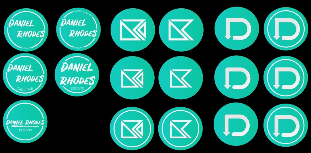
On to the new logo concepts. I know there seems a lot but really there are only three different styles. The first being text based. Just my name in a circle, with different variations. Looking over these I am starting to think that it may be better to just have a symbol. When made smaller a lot of detail is lost and text can become unreadable. So that brings me onto my other two designs.
A geometric take on the lettering “DRD” (standing for Daniel Rhodes Designs), if you didn’t figure that one out already. I quite like this take on my logo as I feel it looks modern but a bit different. Everything fits together perfectly. Then I have just done a couple of different variants, changing the size and adding an extra circle to help focus the viewer’s attention.
The last looks at a more rounded and smooth take on the initial of my first name, as well as the logo I am currently using. I feel that this one looks a lot easier on the eye because of flowing singular line. This type of design style seems to be quite popular at the moment with companies like Google using rounded edges on most of their UI.
So that’s about it for this project, but I did mention you helping in this project. Tomorrow I will be publishing a quick survey asking you which you prefer. So keep an eye out on this blog and my social media if you want your say on my future logo.

Finally, on to the last two projects. I am making some great progress on my M4 Carbine model, as well as finally choosing which game environment I’ll be remastering. Simpsons: Hit & Run. A great game that I grew up with and will hopefully do a good job of. I’ll be posting updates of my work/ progress on social media over the next couple of weeks so be sure to follow me over there.
Well, that was a long blog post. If you got this far thank you and I will see you next week.

Day 23 of Inktober 2018
Couldn’t really think of much more for this that would have fit in a small box

10 days til’ Halloween, so here’s a vampire reference